Eko
Visual identity for a company that creates digital health solutions.
Your thoughts and feedback are appreciated!
Eko produces digital medical devices and offers a platform that helps doctors, nurses, researchers, and health systems to better care for the heart.
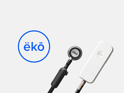
For this proposed rebrand, I created a simple, recognizable logomark and established a visual consistency across their products, website, and social media.
The name is reformatted and kerned to create a strong balance, left to right, using diacritics to both clarify pronunciation and reinforce a visual rhythm. The ring echos the mark's placement on the surface of a stethoscope's bell.
–
I am available for freelance work! If you need a thoughtful, simple visual identity, let's work together! Say hello@jeremiahragsdale.com to get started.


