Skouros Branding
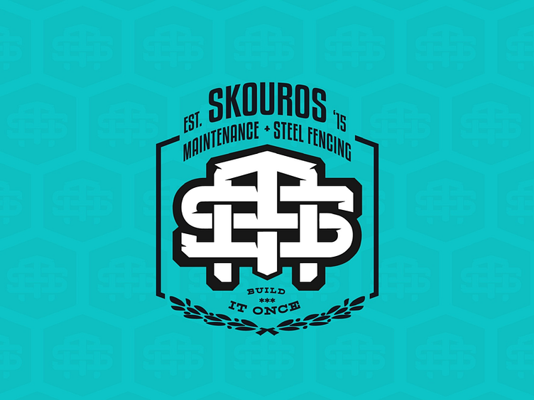
Brand, Visual & UI Project for @skourosmaintenance , a 5 year young, local metal fabrication & domestic/ commercial maintenance company with over 10 years experience on the tools. • The Design Problem: To shrewdly address the 3 distinctive fibres which make up what the Skouros M & S.F. brand represents; Premium Welding & Maintenance, the ‘Build it Once’ mantra & the company values. • The Design Solution: A timeless monogram which evokes the strength of the companies premium delivery of works and a ‘build-it-once’ mentality. The logo is inspired by vintage monograms, metal fabrication & the flag of Cypress. • The End Result: Is a proud and timeless visual identity, purpose built to thrive in any digital or printed environment.
More by Gianluca Caico View profile
Like
