Mini UI Tip - Negative space
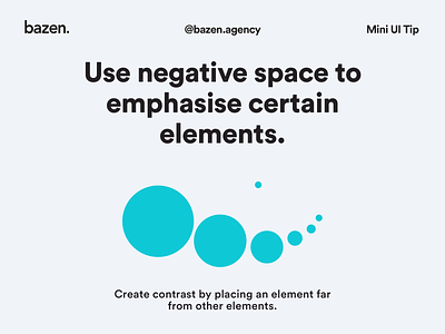
We've already talked about contrast of size, but how about contrast and space usage? _ If negative space and elements of different sizes are cleverly combined, we can make super fun posts! here is one simple example!
More by bazen.talks View profile
Like
