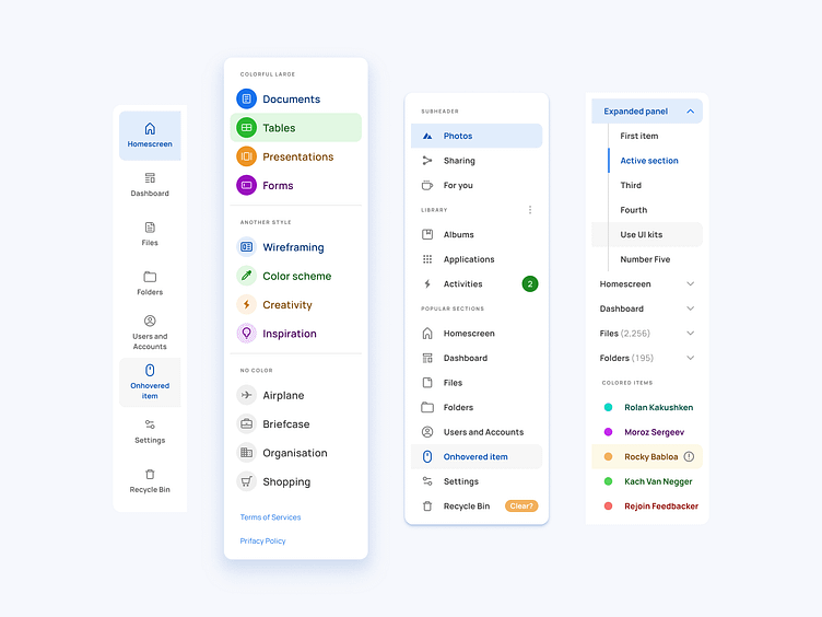
Side navigation components for Material X Ui kit
A library of components from the nearest future beyond material design
900+ components in the design system powered by Auto-layout. Available as local ready-to-use UI library — Purchase, download, Import and publish for your team
31 categories: Accordions, App bars, Badges, Buttons, Calendars, Cards, Chips, Colors, Dialogs, Empty states, Headers, Inputs, Typography, Lists, Menus, Multiselect, Navigation, Pickers, Segments, Sliders, Snack bars, Tabs, Tables, Tab bars, Tooltips and more...
Purchase commercial UI kits to save time and human resources 🏃♂️💨
More by Setproduct View profile
Like
