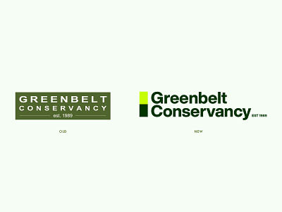
Greenbelt Conservancy Brand Redesign Exercise
I used the Greenbelt Conservancy open logo contest to stretch my branding muscles. I redesigned their brand, focusing on the trail markers as the basis for their new design system. (I did not submit this as an entry, this is purely my own exploration).
The stacked rectangles can be used as brand elements and practical signage to inform trail hikers.
I didn't go too deep but this would be the beginning of a very large design system undertaking if I were hired to actually design their Identity. Still, it's good to get the idea out there. :)
More by Carl Waldron View profile
Like


