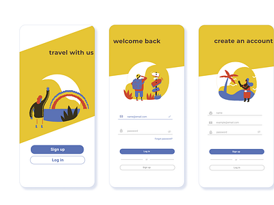
Travel with us - Daily UI
Recently I've been working on re-designing the Expedia travel website, and combined my first UI challenge with this project by using similar concept (travel) and colour scheme. I played around with a few colours but found it too messy and ultimately stayed with yellow and blue as the primary colours.
More by Michelle View profile
Like
