Barkar - branding
A new branding and strategy for Barkar.
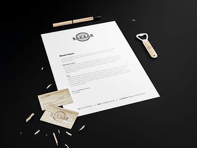
The logo represents the handcrafted method to produce the product. The tire is used as the main element for the logo. The typography has the same artisanal look as the product. This same artisanal way of thinking can you see in other elements from the brand as well. For example, Joren used relief in the letter and engraved wooden business cards.
Contact me for collaboration: info@jorenbrosens.com