Decora Branding
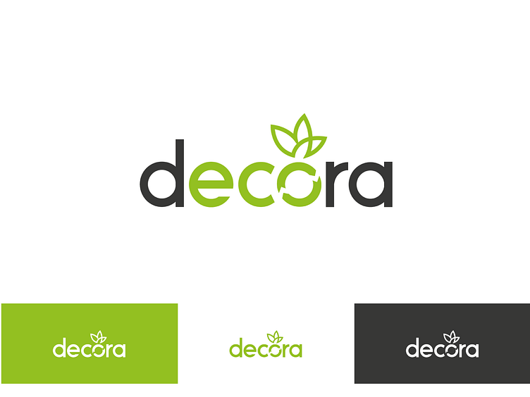
The decora wordmark consists of the simplistic modern typeface Ikaros to represent a friendly and high-end furniture design brand that reflects their mission to show to the world that saving the planet shouldn’t have to be complicated. The word ‘eco’ is highlighted in green to emphasize decora’s mission of being eco-friendly The ‘o’ in decora resembles a simplified recycle symbol with two arrows connecting to each other in a cycle. The brand focuses on plastic recycling manufacturing enterprise that will convert plastic waste into eco plant pots/or vase. This is why the ‘o’ in the wordmark also serves as the container of the icon that resembles a plant.