KalisaAN Branding
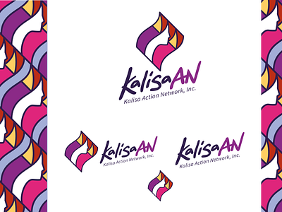
The idea here is to represent Women Empowerment movement in Bangsamora Autonomous Region in Muslim Mindanao. We made use of the vinta symbol and used feminine colours so that the first impression will already say that the network is about women; the vinta shape is "wavy" to show movement and fluidity and we made it the major shape of the logo since it is a symbol associated with the people in this part of Mindanao. lastly, we represented the three operational framework of KalisaAN by showing three sections of the vinta. the female face is also simplified to make it easy to remember and for women to be able to identify themselves with the character.
More by Ryan Camansa View profile
Like
