Paws and Claws
The design process started with an analysis of the company's vision: "we understand that your pets are valued family members." This line is beautiful since it invokes emotions, which are powerful driving forces in humans' decision-making process. The design question for me was how to visualize this force and make an emotional relationship between the brand, the pet owners, and their pets.
Another statement in the brand's vision referred to the alternative treatment approach and the holistic perception that encapsulates this method. It was clear that the goal of invoking emotions must be accommodated by a supporting naturalistic theme of all the visual elements. The immediate association that comes to mind is of natural colors, rounded fonts, and ambient atmosphere.
The third question I had to deal with is how to communicate everything using a long name such as Paws and Claws. A brand name that is made of three words requires additional creativity power in terms of composition. In the design brief, the company requested that the logo provide the full name and a mark. Which means the composition must include four graphic elements. In the old printed world, that would have been less of a problem. However, in a world where a logo must accommodate different sizes, multiple elements, and long names, too many factors can pose serious challenges. Requirements such as responsive web designs, favicons, app icons, and low resolutions must be counted.
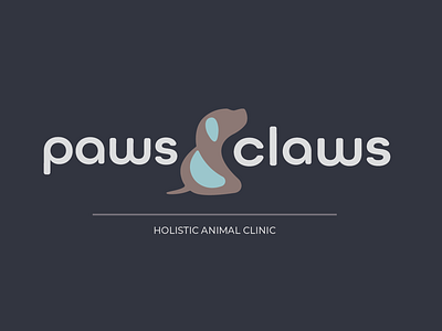
To simplify the problem I disregarded the color theme and focused on the emotions and the mechanical part. To reduce the number of elements, I fused the 'and' in the name with the mark. It was more manageable by using the '&' sign rather than the word itself. The '&' symbol resembled a pet's shape (at least to me), so I decided to follow along with this idea. But I wanted a somewhat helpless pet, like the kind you take to a clinic; I wanted a puppy. From this point on, there were many trials and errors process until eventually, I got what I wanted. The puppy looked helpless and cute, and it also resembled an ampersand.
Once I was done with the mark, the rest of the pieces fell into place pretty smoothly. I selected a rounded font (All Round Gothic) that looked friendly and inviting. Some of the characters in the logo were customized to give it the extra roundness and friendliness. I created two versions, one landscape and one responsive. In both, the emphasis was on placing the mark where it can function as the welding point between the two words.
Finally, selecting and applying the color theme. My goal was to achieve the natural effect and holistic encapsulation I was striving for initially. To strengthen the parenting feeling and the infinite dependency of the pets on their owners, I wanted the color to communicate childhood. Lively colors such as pale blue, sky blue, pastel brown, and burgundy seem to drive the emotions in the desired direction. To keep the tones low, I reduced their saturation to a perceived equilibrium point.
