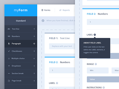
Form fields UI
Hello everybody,
these shots are an other part of the « myForm » project I designed a couple of days ago. This view shows the form builder when a user has added some fields and want to edit them.
There is one more interaction with « field blocks » present in the right part of the app. When a user is hovering a block, the top border, title and control buttons get darker. Also, there may be some cursor changes to explicitly shows you can drag’n’drop those blocks again, to change their orders.
I tried to keep things pretty clean and minimal, also, easy to scan as the document can contain a lot of field blocks. One of the solutions I found was to reduce contrast in inactive blocks.
The - and + control buttons let you easily remove the active field or even add one of the same kind below.
You’ll also find the « preview » part of this form. Just to give an example of what the user could end on.
I hope you’ll appreciate this, feedbacks appreciated as always ;)
Have a nice week dribbblers!
Edit: A detailed view of the project can be found on Behance.


