Monotype Fonts - UX Patterns
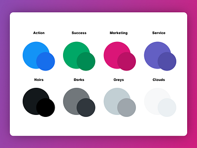
I spent a long time mixing up a color palette that could be used everywhere across Monotype's product design language.
The toughest part of this exercise was striking the right balance between AA accessibility and an attractive color scheme.
The final palette includes color variations for contrast depending on text size, outline of fill.
It may not be obvious at first, but I added the smallest amount of blue into all of the grey colors. This adds warmth and nudges the palette further away from a technical/software aesthetic.
