Chess Branding
Brand: CHESS
Our Challenge
Chess is a peer to peer lending platform designed to help investors and borrowers exchange loans directly without the involvement of banks. Users will find all the facilities provided by banks on this platform.
For investors, Chess is the place where they can look at the details of the borrowers, keep track of their investments, a platform to maintain contracts, and collect loans. While for borrowers, Chess is a loan account that allows them to take loans up to their credit limits, repay those loans, and check their transaction history.
Chess approached Ofspace Digital Agency for assistance to establish its brand identity as a unique product designed to simplify the process of credit and its management.
Our Approach
In a world where finding a paid job is getting more and more competitive, Chess decided to develop a system that not only allows white-collar workers to get loans at a low rate but also easy and flexible in terms of granting loans. It is an online app with full offline support.
We understood the underlying message of Chess as a brand and needed to create a brand identity that would embody their brand attribute in a sincere, professional, and modern way.
Chess needed a brand attribute that would ensure the feeling of safety and trustworthiness along with professionalism among its customers.
Communication
Expressing ideas and methods is an integral part of brand identity. To help Chess communicate with their clients, we developed a guideline defining how to express themselves better both verbally and through symbols.
Our aim was to create a message that is professional, welcoming, sophisticated, and inspiring.
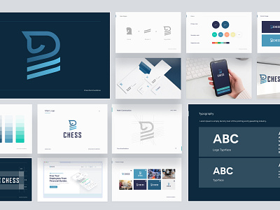
Logomark
Before deciding to land on one specific logomark for Chess, we explore various different options around the theme and concept of the product. Our ultimate decision was to combine the symbol of the horse from the chessboard and the Roman number.
Chess, in many ways, represents itself as a knight from the game of chess by protecting the investments and credits that both investors and borrowers exchange. It creates a perfect balance between convenience and a feeling of security among users.
The color Blue has been used in different variants to symbolize trust and stability in and around the logo.
Logotype
The Chess logotype has been built using the typeface Agency FB Bold. Agency FB Bold font creates an artistic look in all capitals of the typeface allowing the logo to take less space while being clearly visible to the users.
All uppercase letters are used in the logo to create a sense of authority in the minds of the users. While lowercase letters could have been seen as a more approachable option, Agency FB Bold with its uppercase typeface demonstrates control.
Press "L" if you like it.
✉️ Have a project idea? We are available for new projects hello@ofspace.co
🔥 We will provide a quick analysis and a free proposal for it. Don’t worry, it is secure and confidential.
🌎 Follow us
Instagram | Dribbble | Facebook | Behance