App Menu
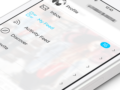
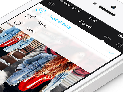
Next up is the app menu. Usually i follow the standard rules of sliding the main content to the right to reveal the menu behind but for this app the main focus is the content and i wanted to try something different.
I decided to make the menu slide over the content and use iOS's blur effect to give some depth to the app. The user will be able to not only see what section they are in from the menu but also from the content behind.
Thanks :)
More by Michael Shanks View profile
Like

