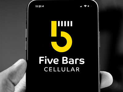
5 Bars Cellular Logo
It’s always interesting to see where there is a color hole in an industry. With the Sprint logo being retired after the company’s merger with T-mobile, there’s now an opportunity for a major mobile phone carrier to adopt yellow for its brand.
For that reason, aside from it being a bright, beautiful color that is associated with some amazing things (🌻🐝🍌🍍🧀🍯🌞), yellow was chosen for the 5 Bars logo. The logo mark was paired with a sans serif typeface that is super legible, modern, and friendly- Co by Dalton Maag (Typefaces that have a range of fonts with various weights make great choices for brands due to their versatility!).
More by Colin Merrill View profile
Like


