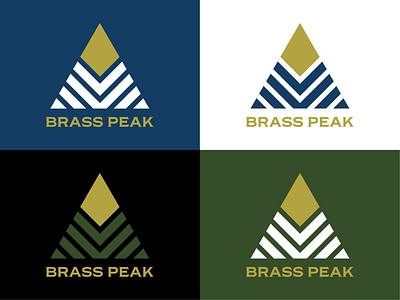
Brass Peak Brand Identity
Designing for outdoorsy companies is a lot of fun. Each element of this combination logo, made up of an abstract geometric mountain and the “Brass Peak” wordmark, can be separated and used as standalone branding pieces. Kept this one simple in order to evoke a classy, but rugged/edgy vibe. The Shackleton typeface, by Fort Foundry, is the perfect fit for this logo because it has the classic feel of Copperplate Gothic with a more updated, modern spin. After completing a logo, sometimes there's an itch that needs to be scratched by going deeper and exploring the endless design possibilities. Badges are a really satisfying way to play around with typography, shapes, and color combinations.
More by Colin Merrill View profile
Like


