photo editing app UI

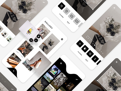
played around and put together a UI for an imaginary photo editing app. I honestly couldn't fit a colour scheme other than the simple monochromatic b&w, which is why it looks rather plain.
fun fact: this is actually my first (proper) go at UI design, so if you happen to stumble upon this and know a thing or two about UI/UX, do leave me suggestions/feedbacks on what to improve!
designed nov 2020.