Channel Messenger App


Apart from the web-based chat client, Zib Messenger had a Mobile app as well.
At first, we wanted to create 2 apps, for Android and iOS, following design guides for both, material and iOS. Eventually, we decided to blend the app into one hybrid app, with very minimal changes in UI components such as switchers, tabs, etc.
This was a challenge for me at first, but then I researched hybrid apps and found out that today, a lot of companies are going in that direction, and they are even blending the code using the IONIC framework or so ...
My role was to design the screens and define the requirements for a solid channel chat messenger. The client had a good understanding of some extra innovative features related to this project which I can not expose at the moment, but the project had no list of screens needed for a good feature-rich mobile messenger. My goal was to list all things needed to be designed and execute the design itself.
I started doing wireframes of the core screens of the app, and all those innovative features that were never designed before. Then we had call sessions with developers and focus groups and asked them about how they see the product's innovative features. During this period, wireframes and later hi-fidelity design of the app had changed drastically. We wanted to see something new, something unique, as there are a lot of messengers on the market, that was not an easy task.
I researched all other apps for communication, did tests on them, measured font sizes, and all. As in this kind of app, font size is a very very tricky, and responsible decision. On a single screen, there can be so much text, that if the font is just a little smaller or bigger the whole screen is loosing on readability. I always try to take care of solid contrast between CTA buttons and Icons, and with the app complex like this one, it can be tricky to find the balance. That is why I had so many different ideas about design style and explored other apps so greatly.
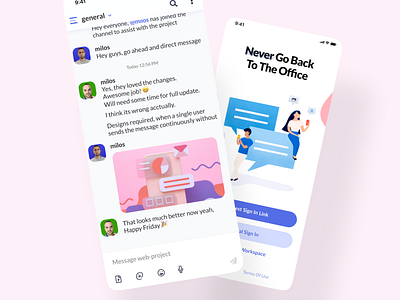
In the end, I believe that we managed to come up with a unique design style, which was previously partly defined in the web project.
I learned about how difficult it can be to design something that should be generic in overall but have its distinctive touch. Also, I learned how important it is to choose a good - readable font and its size, if on the screen there will be more than 80% textual interaction. How just small differences in font and its size can dramatically change its readability, and how difficult it is to maintain strong contrast if there are many elements/actions to be taken on one single screen.
