Event Management Platform Design
The team is available for new projects! Drop us a line: hello@purrweb.com | WhatsApp | Website
What’s up, guys? Welcome to our new shot! This is how we designed an app for organizing and selling tickets for events.
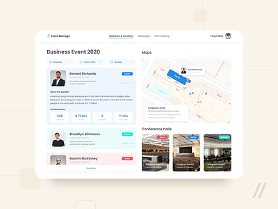
🎤 On the left you can see a speaker's card with date, time of presentation and topic of the report. There are labels for halls where speakers perform, they are marked with color coding: Mars is red, Earth — blue, Uranus — light blue, etc.
📣 When you click ‘Details’ you can see info about the speaker.
🧭 On the right there is a block with halls for performances and a map with access to the conference hall, color coding is used for halls too. We took the blue color to contrast with the light interface.
The ‘thing’ of the app — the ability to view all the information about the event online with detailed descriptions.
Created by Purrweb Team
Press L if you like our design and share feedback!
PS We know to utilize UI/UX design to make users fall in love with a product. Check out how we used our skills to:
- raise $400k as capital for startup
- streamline cryptocurrency e-wallet
- reboot a Real Estate startup
- help newbies jump into investing
- conquer the chef freelance market
- simplify the life of event organizers
And that's not all — you can find more case studies in our Blog! 💜


