Apple Music Artist Profile Explorations

👩🏿🎤 Apple Music Artist View Redesign
So I just switched back to Apple Music and I’m genuinely amazed by the attention to detail in this app. Shouldn't be surprised though, it’s an Apple Product isn’t it? Player view with Lyrics feature and it’s interaction design is Noble! 🤩
As a part of my repetitive Become a Better Designer Training I challenged myself to play with the style of this beautiful product and come up with some sleek views. The exports above present my take on the artist profile screen.
🐦 Join the discussion on Twitter
🌈 Follow my work on Instagram
🚶🏻♂️ UI Walkthrough
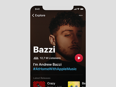
Let’s start with a substantial picture of an artist. The assumption is it’s 100% width and height. This way it’s easier to convey the artist's identity/ style to the view. To keep the UI readable we apply a set of overlay gradients at the top and bottom. The solution was tested with a variety of pictures (including very bright ones) and seems to perform very well in all cases. The presentation albeit features quite a dark picture so it might seem like it doesn’t necessarily reach the bottom of the screen. Worth mentioning is also the treatment of proportions of the navigation control items. Reasonably Apple tries to keep them 1:1 consistent dimension and position wise.
For the purpose of the exercise I decided to gently mess with it. Generally speaking now they are moderately bigger. With such an approach the UI leans towards being just a touch more spirited.
The design follows the 5dp grid. So far it’s been performing very well.
Presented interface exports are of the iPhone 11 Pro (or similar) screen resolution.
Bazzi
Presented view features the image of an American singer, songwriter, and record producer- Andrew Bazzi. https://music.apple.com/us/artist/bazzi/800263205
--
Now the primary next move is to work out the light mode treatment.
*concept work
*work in progress
