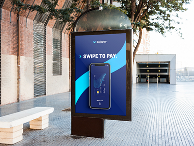
Swippay Advertising | A young bank app
Swippay being a young brand and following the current trend must have a graphic line that evokes these feelings. That's why I've taken up this "flow" in shades of blue. On the other hand, the business card is made to look like a credit card. The person's number is displayed instead of the card number and information such as name, profession and email address is displayed as well as the expiry date and the name of the owner of the card. In the background, we find this flow which allows us to Then, the bank card is dematerialised on the application. I therefore made several interfaces of a potential application allowing online payment in order to show the universe in which Swippay could be. Rather intuitive and easy to use, it allows young people to better understand and manage their account. I chose to put the background in dark blue because it is less aggressive and it brings out the brand's colours. The advertising represents the interface at the time of payment (the swipe upwards to activate the transaction) because it is THE Swippay specificity. The slogan is clear and concise: Swipe to pay, which is the founding principle of this application. Then we find our blue curve in the background. The animation of this advertisement is quick to show how easy and fast it is to make online payments. The wifi symbol shows the fact of paying remotely and the connection from one to the other. Then the card sliding upwards reproduces the "swipe" movement and shows the moment of the transaction ———————————————————— 🌐 My website : https://hurtikonn.wixsite.com/hurtikonngraphic ————————————————————
