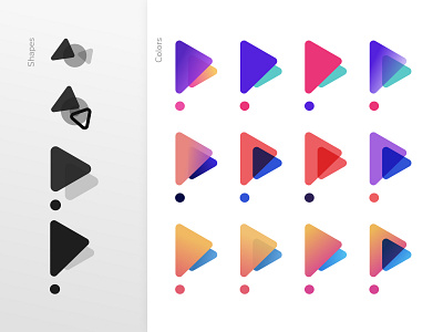
Proximity Pay - Logo design
Client project for a payment solution :
It was interesting to create something with the double P without looking like the Paypal logo ;)
We did a lot of tests based on my logos benchmark and then we found the perfect triangle to represent the letter P. Modern colors and abstract shape layered.
More by Loic Vieira View profile
Like


