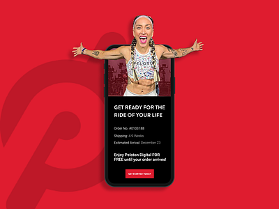
Daily UI 9 Confirmation Page
This was a fun experiment for me.
The prompt was to create a confirmation page and I thought to an unrelated conversation I'd just had about Peloton (haven't had the opportunity to get one myself but a girl can dream).
This is a sample order confirmation for a Peloton purchase which is intended to capture the excitement of participating in a Peloton class while maintaining the modern simplicity of Peloton's branding.
The marketer in me added the Peloton Digital subscription as a way to delight the user and get them to start enjoying Peloton while they wait for their bike to arrive.
*This is a concept piece and is not affiliated with Peloton. All opinions are my own. Free Peloton Digital is a concept and is not a real offer.
More by Sarah Klein View profile
Like
