Another Unchosen Brand Direction for Liberation Barbell Club
An unchosen brand direction for a weightlifting gym based in Austin, TX.
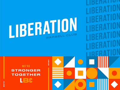
The goal was to create a brand that felt drastically different than the stereotypical gym brands that are overly masculine for a brand that felt more community-centric and inclusive. This direction uses a bold color palette with fun brand elements and a shape-based pattern to highlight a diverse range of people and reasons for weightlifting.
Interested in working with me?
I'm currently open for new freelance opportunities:
hello@linseypeterson.com
Check out more of my work here.