Livsvaerk - architecture firm
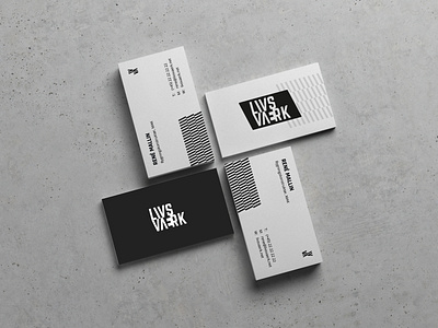
"Don't use colors" the client said.
"I want a black & white identity"
For this concept. I took a look at how the general logos for architecture firms looked, and wanted Livsværk to look as a part of this universe - but still with more distinctiveness.
The trend for danish architecture firms, seems to be simple sans serif typefaces. And that's that..
I, and the client, wanted to do something diferrent, while still looking like a professional studio.