BRANDING for Borderline Asso
CLIENT
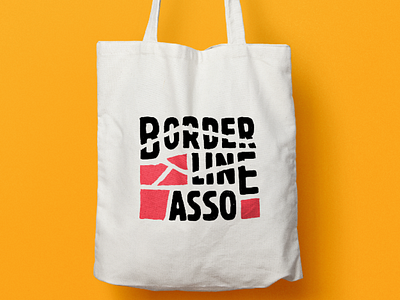
Borderline asso is a Paris-based non-profit association that promotes multi-disciplinary and multi-cultural events. It's target audience is 16-35 year-olds who are close to underground and alternative scenes, and close to associative communities.
CLIENT BRIEF
The logo has to be abstract (non-illustrative), bold and edgy. It has to draw its inspiration in the tradition of protest art.
BRANDING SOLUTION
After sketching several different logos, we went for the abstract shapes that resemble a map. The line represents the journey instead of a border, which fits the vision of the association. The hand-drawn type is inspired by the font Block, which was used extensively in May '68 protest posters in France.
The logo had to work well in one color. It worked on screen printed t-shirt for event merchandising. It's readable and distinctive.
