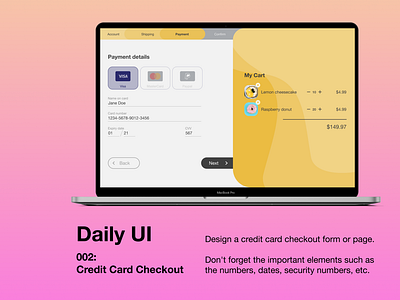
Daily UI - 002 Credit card checkout
Trying out the Daily UI challenge during November.
Today is a credit card checkout page. I wanted something clean and simple.
I think it worked in that sense but I'm not happy with the colour scheme and the cart overlay.
#dailyui
More by Etienne View profile
Like
