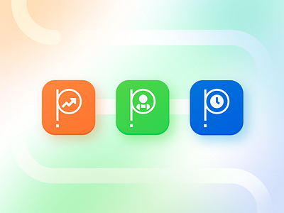
Push Operations App Icons
Does anyone else feel the pain when you start at a company and their app store icon is a low-resolution pixelated image?... On top of that folks were also finding it difficult to distinguish between the apps and didn't know which to download. I whipped these up using the "P" in the Push Operations logo to highlight the existing brand as well as the differences between the apps: Manager, Employee, and Time Clock turning it into a cohesive suite of products you can find on the app store.
More by Ashley Ringham View profile
Like
