#DailyUI 005 App Icon
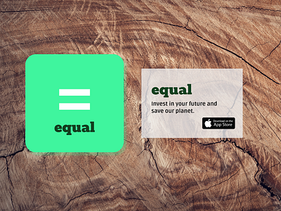
Recently, I was reading about the cognitive overload on mobile apps and the increasing use of gradients and saturated colours. Is it possible nowadays to stand out without overwhelming the user?
Recently, I was reading about the cognitive overload on mobile apps and the increasing use of gradients and saturated colours. Is it possible nowadays to stand out without overwhelming the user?
