The Athletic - App Icon Updates


First off, I want to start by saying I'm a big fan of The Athletic and the overall brand styling created by Stu Ohler and his team. Both the site and mobile app are superb, and really bolster the outstanding sports journalism on its platform.
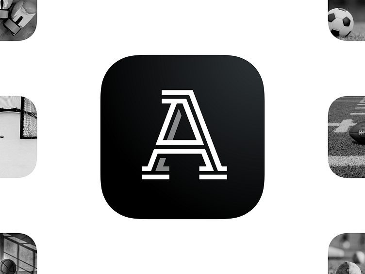
I noticed, though, that while the app icon has the logo geometrically aligned vertically and horizontally, this creates an optical alignment issue. I optically aligned the logo, added some slight shadowing to create a little more depth, and increased the size of the logo to further help it stand out on users' screens.
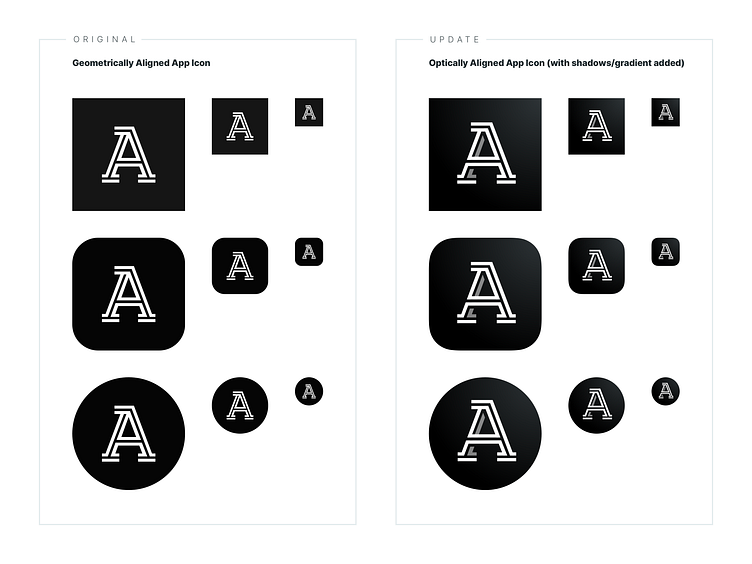
On the second screen, I show the current logo and it's alignment in various bounding shapes/sizes, as well as the updated icon in the same shapes/sizes. Smaller sizes are where this alignment issue stands out most, which is important to keep in mind as this logo is often seen at this smaller size in iOS and Android environments.
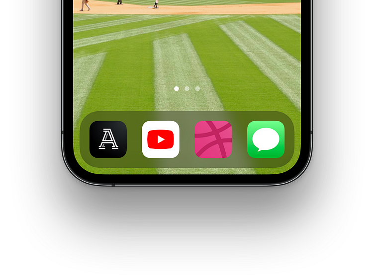
Lastly, on the third page, I mocked up an example of how the updated icon would look in context of the iOS dock.
Reminder that this is a fan appreciation post! Credit to all of the awesome design work done by The Athletic! Keep up the great work!
First off, I want to start by saying I'm a big fan of The Athletic and the overall brand styling created by Stu Ohler and his team. Both the site and mobile app are superb, and really bolster the outstanding sports journalism on its platform.
I noticed, though, that while the app icon has the logo geometrically aligned vertically and horizontally, this creates an optical alignment issue. I optically aligned the logo, added some slight shadowing to create a little more depth, and increased the size of the logo to further help it stand out on users' screens.
On the second screen, I show the current logo and it's alignment in various bounding shapes/sizes, as well as the updated icon in the same shapes/sizes. Smaller sizes are where this alignment issue stands out most, which is important to keep in mind as this logo is often seen at this smaller size in iOS and Android environments.
Lastly, on the third page, I mocked up an example of how the updated icon would look in context of the iOS dock.
Reminder that this is a fan appreciation post! Credit to all of the awesome design work done by The Athletic! Keep up the great work!