Logo Rebound
Here is the finalized version of my logo.
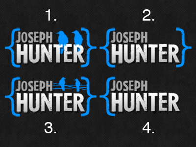
I like that it's nice and simple. I did like the birds also but when it came to using them elsewhere as graphic elements it started to feel forced. Plus they never had a real meaning to me, they were just visually appealing.
My new site is up! Stop over and take a look so you can see my logo in context: www.josephhunter.net
Thanks again for the feedback!
More by Joe Hunter View profile
Like

