Tamil Nadu Poultry Farmers Association Logo
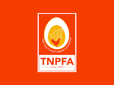
We chose orange keeping in mind the color psychology of triggering the appetite. A minimal logo with an elaborate icon- featuring the Tamil Nadu map as well as a hen embedded in an egg-yolk-like motif. The logo is memorable even when used separately thanks to it's the literal ideation.
We wanted to avoid any poultry related palette like white and red. The logo was designed with a simple leghorn chicken (The main chicken variety found in the Namakkal belt of Tamil Nadu) and the Tamil Nadu map within the cross-section of an egg.
