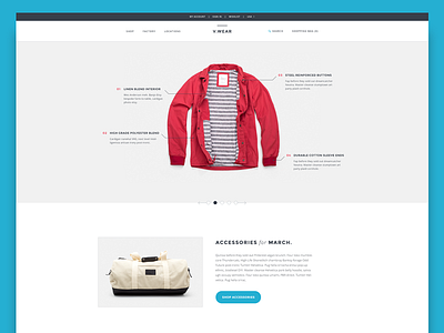
Menswear Site
I've been using a service called Munchery lately and was inspired to try something after seeing their "how it works"section. While they're in the food business, I wanted to try and apply something similar to clothing. Only the hero really borrows from their style.
I wanted to go for something clean, minimal, and simple. This is the way I like clothing or accessories to be presented. Sometimes all the clutter and banners can detract from the quality of the products themselves. If I were to start a clothing company, this is probably close to how I would create the site design.
** images are from Saturdays NYC (incredible clothing company) and J. Crew.
More by Vivek Venkatraman View profile
Like

