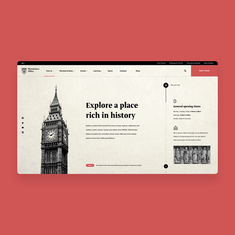
Westminster Abbey - Website Redesign
Westminster Abbey website looks like it needs a face lifting. So, I made a concept, just to kill a little spare time. Unfortunately, I could not find a good illustration of the church towers, from the right angle. I used the amazing Big Ben tower illustration instead. I know, it's a little out of context, but when I find the right image, I will replace it....perhaps :)
I hope this inspires you for you next project!
More by Nejc Smirmaul View profile
Like
