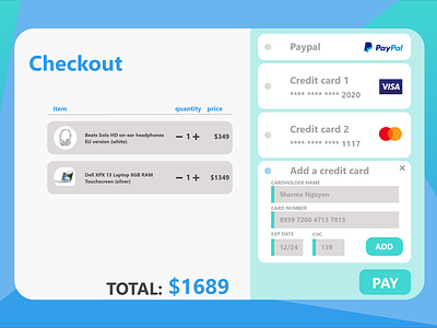
Credit Card Checkout Screen UI
Today's #DailyUI challenge was to design a credit card checkout form or page.
I did a quick competitive analysis and decided on a bright, fresh blue and turquoise palette with strong graphical elements.
I made sure to include everything you'd find on a typical credit card checkout screen. And I added items that I purchased recently (headphones and a laptop).
More by Guin White (Cherokee Nation | She/Her) View profile
Like
