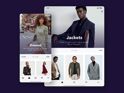
Product Listing Page
I worked on two breakpoints for the app. Coming to iPad, the larger screen size certainly helped with the immersion so aim was to take full advantage of it by using larger images for the page header. Increasing the column count allowed users to view more products at a glance.
More by Cagri Yurtbasi View profile
Like
