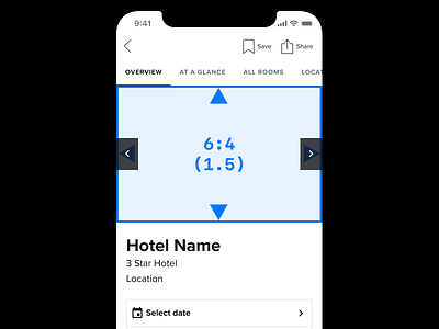
Jump Bar
Some recent work I did on our Hotel Pages within our iOS and Android apps.
We wanted to include both room details and hotel information on one page. The reason for this change was based on an assumption: we found our previous tabs didn't do a good enough job at providing people with a way to switch between sections as not enough people were doing it.
There could be multiple reasons for this, some of which could be due to the visibility and/or position of the tabs for e.g.
One experiment we want to run is by giving the customer visibility of what's coming up on the page, as well as being able to jump to a specific position on the page. Will this increase page engagement and ultimately improve conversions?
Reducing the number of sections was also another idea put forward.
Attached is a video demonstration and some other options explored.

