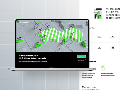
Rockserve full website
Here’s a glimpse of the full website design we made for a brokerage company. Following a simple and practical Rule of Three, we sectioned the page with color blocks and contrast. It was fun to pick the brand accent since there’s nothing like a few splashes of fresh color to top off the organized, intuitive design.
Stick around to find out more of this website’s design treasures and email us if you've got any project ideas!
📨friends@flexy.global
More by Flexy Global View profile
Like

