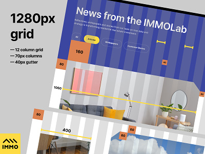
Immo Capital - Grid System
Hi folks!
Sharing the grid layout and spacing system from the Immo Capital design process. As you can see we've used a 1280px grid system for the 1440px view-port. We've used 70px columns with 40px gutter. This results in a very precise spacing and column groups like 1/3 being 400px, 1/4 being 290px etc.
Additionally, we've introduced vertical spacers to better control the environment, these spacers use the same rounded number approach to make it easier to maintain across the whole platform.
Our vertical spacers are predominantly numbers such as 200px, 160px, 120px, 100px, 80px, 60px and so on.
Hope it helps when structuring your own spacing system.
Check out the LIVE SITE
All the best,
Filip
---
We are BB Agency
Full-service creative agency specialized in crafting human-centric digital experiences. Through challenging core assumptions, we shape the products and services that improve the lives of thousands every single day.
Check us out at www.bb.agency
Give BB Agency a follow below:
Behance / Instagram / Facebook / Linkedin


