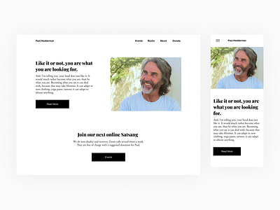
Paul Hedderman Concept Website
Today I wanted to do a design for another spiritual teacher I like, Paul Hedderman of zenbitchslap.com. He talks about non-duality. I played with a lot more ideas for this one than for the Eckhart one, which had such a great photo the concept sort of made itself evident. For Paul's site, there were a lot more options on what to do since his images were of such varying quality and in different periods of his life. I wanted to use a photo that is recent, and I had several options there too - some of which could look sad at a glance. So I picked one where he's smiling and I touched up the photo to make it brighter. I also played with different colors for the background and fonts, but it just didn't fit his simple message. I wanted a design that didn't seem commercial - because he is a spiritual teacher and this isn't a for-profit business. But I also wanted something classy, professional, and modern. To be honest I am still not completely happy with this design but since it's just a daily design I'm going to leave it like this and move on. If I were to continue working on this, I'd play with more options for imagery for the background, like landscapes, and with fonts that are even more "spritual" looking. I still feel it looks too commercial given the nature of zenbitchslap and Paul. Oh well here it is!
