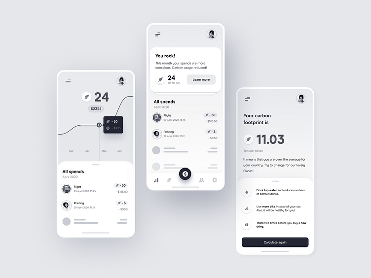
Wireframes for environmental awareness app
When you are super excited about working on
# new product # redesign # or utterly new section of the app,
the first main focus is to explore various approaches and sometimes throw away a lot of discussed ideas in the trash. That means making a lot of design changes in a shorter time.
Jumping immediately into visual style can extend the time needed to work on actually not used ideas. In Widelab, in these cases, we propose to wireframing as an initial step. Not perfect, black&white design with a generic style helps focus on how the app will work. As a next step, we are coming back with a final UI concept with colours, typography, shapes, and your brand identity.
Above three different versions for the same app concept, that I worked with @Michał Parulski.
Visit our team profile! More stuff coming soon!
Do you need some help? Send us message: contact@widelab.co
--- Do you like it? Press "L".
Read more about Widelab and review full case studies: www.widelab.co
