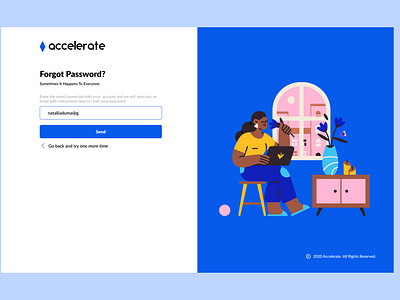
Forgot Password form
Hello, dear community☀️
Hope you are doing well during these tough times.
I want to share my latest shots with you. Just wanted to make a truly useful and bright onboarding process for Accelerate🙌✨
Late font family was chosen because it is easy to read with any size.
The blue color on the input highlights where the customer is focused on the website.
It can be very irritating, when you enter a wrong password, but cannot view it to fix, therefore I added a «Show/hide password» feature.
I added a quick sign up via Google (more options can be added later). This way the customer gets a very good impression of the product from the very first steps on the website.
«Privacy Policy» link is located on a visible place for user to find information about how their data will be used.
Everything is just on point, everyone could use page without issues. .
Please appreciate any way you like💕
If you are looking for someone, who is able to make your ideas to turn into real design write me.
Btw, I am looking forward to join a team/company in Kyiv 😊☕️☕️
