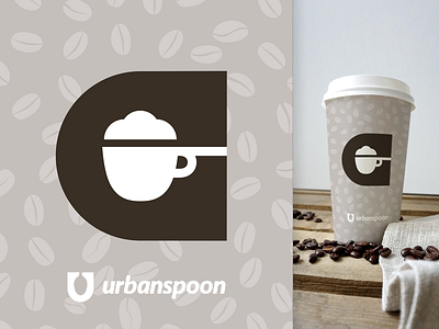
Urbanspoon Rebound
The Urbanspoon re-brand got me thinking. It would be cool if you had other products (ex Coffee) to create different icons for each that matches to the style of the "U" spoon. So if you had coffee you'd use a Capital C out of the same font treatment, use a brown color for the "C" and then use the cutout in the middle of the "C" as a coffee icon. Eventually you'd have a ton of different matching icons to match all the different product lines you had. Here's an example of what I was thinking.
SEE PIXELS FOR COFFEE CUP APPLICATION
More by Chris Whalen View profile
Like

