Watford FC. Logo design Concept
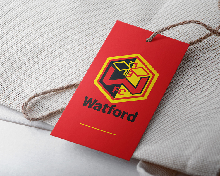
The new identity has three main elements. Firstly, the hexagon base that represents the family and home. Furthermore, the hornets’ nest builds up with hexagonal cells hence the reason the badge has this shape. Secondly, a letter mark. The ‘W’ letter mark. During the process I knew I wanted craft a letter mark that can be used on its own and it identifies the team at the same time. Finally, a hornet symbol. As a team called the “Hornets” it was clear from the beginning I will use a hornet in the logo design. I wanted to create something very simple but aesthetically fit for the badge.