LEMN™


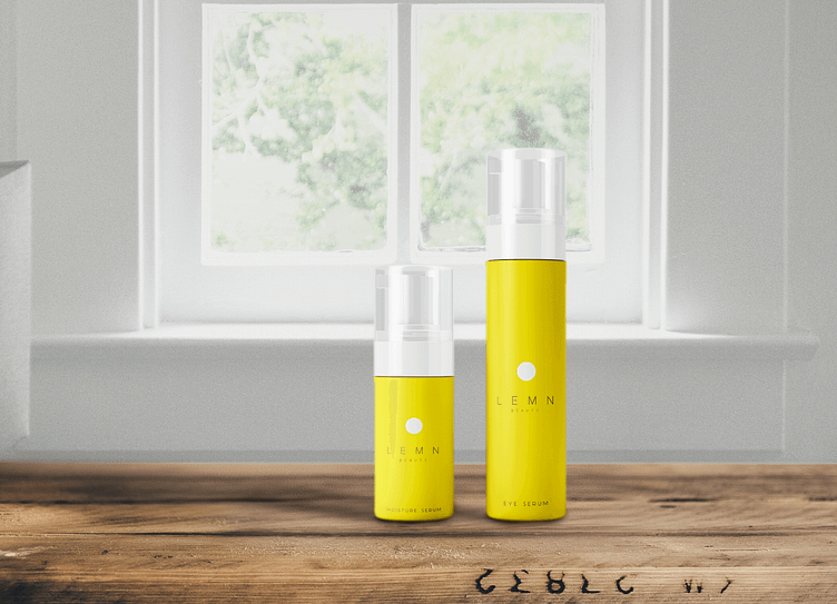


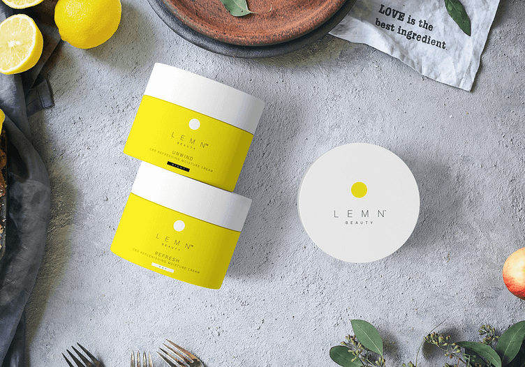


LEMN was the concept built on the simple skin and homeopathic care infused with CBD. I wanted the branding and packaging to reflect this simple notion of pure and clean, eco-friendly ingredients.
By taking the "O" from lemon, it helped strip down this concept to its bare minimum. The use of two colors for the entire line also helped re-emphasize this super simple product. Bright look reflecting an enlightened product.
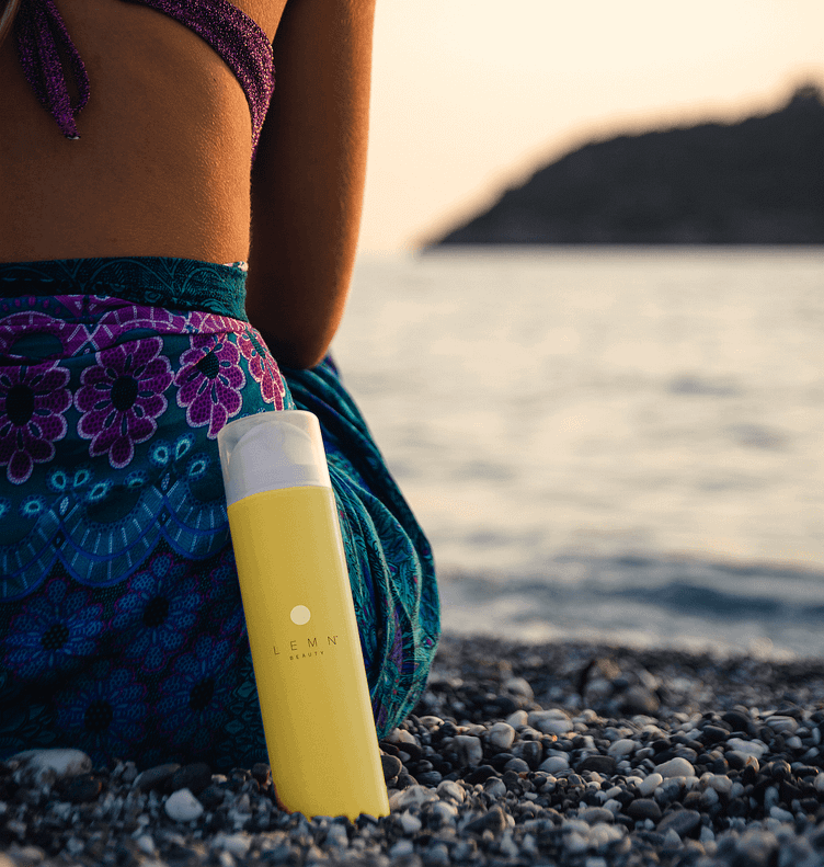
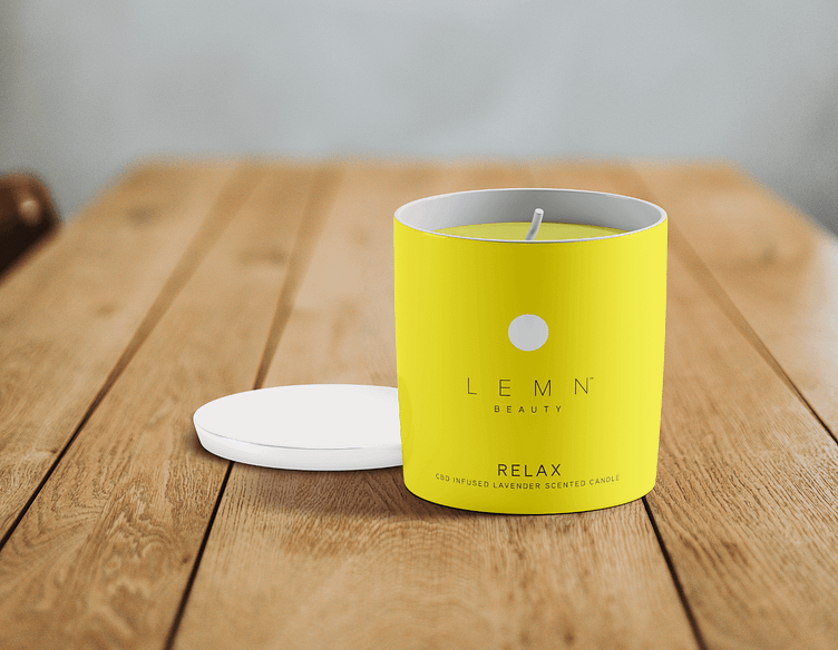
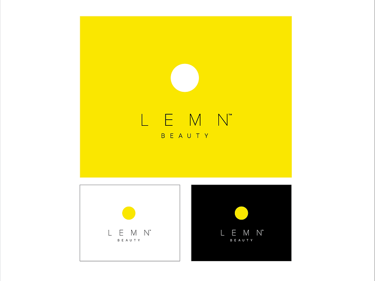
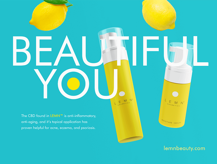