do2learn re-design


New month, new challenge! A redesign for a website I’ve used a lot when working with kids: https://do2learn.com/.
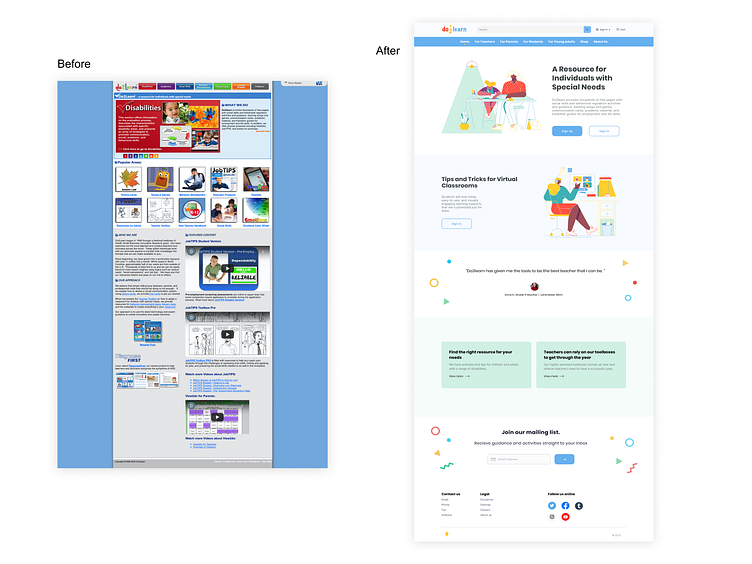
Before: -Navigation bar has unclear labels (not sure what the content is, takes a lot of effort to browse the site) -Shopping basket is not connected to navigation bar -Too many products/offerings for the homepage -No clear CTAs
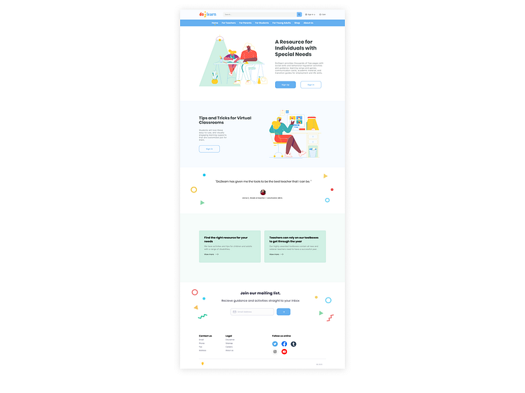
After: -Re-designed the homepage to clearly introduce the site and included multiple CTAs -Added a prominently located search bar -Re-designed the navigation bar to include an “About us” section and clearer labels -Added the account and cart buttons to the top navigation -Organized the drop-down lists from the top navigation -Increased the size of the footer section & included social media links -Kept the original light blue, red, green and yellow color scheme but added a lot more white and some playful illustrations -Updated the logo
Here’s the prototype where you can play around with the navigation buttons:
#octoberoptimization
New month, new challenge! A redesign for a website I’ve used a lot when working with kids: https://do2learn.com/.
Before: -Navigation bar has unclear labels (not sure what the content is, takes a lot of effort to browse the site) -Shopping basket is not connected to navigation bar -Too many products/offerings for the homepage -No clear CTAs
After: -Re-designed the homepage to clearly introduce the site and included multiple CTAs -Added a prominently located search bar -Re-designed the navigation bar to include an “About us” section and clearer labels -Added the account and cart buttons to the top navigation -Organized the drop-down lists from the top navigation -Increased the size of the footer section & included social media links -Kept the original light blue, red, green and yellow color scheme but added a lot more white and some playful illustrations -Updated the logo
Here’s the prototype where you can play around with the navigation buttons:
#octoberoptimization
