01: Personal Branding
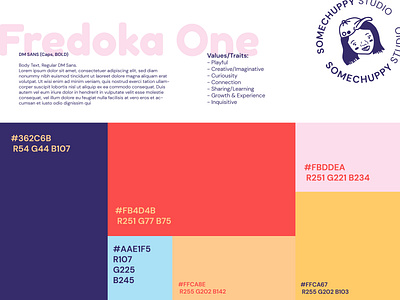
Developing my personal branding, I choose colours that were bright but not overly saturated to showcase a curious, youthful but vibrant brand. I have a friendly nature and wanted to give this vibe through the use of Fredoka One, one of my main heading fonts. Paired with that is DM Sans as stability, cleanness and structure as I like to keep a professional attitude to work where I work hard and keep organised. A mix of circular shapes and boxes as contrasting features but still representing who I am.
More by SomeChuppy Studio View profile
Like
