RedBull Logo Redesign Concept
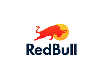

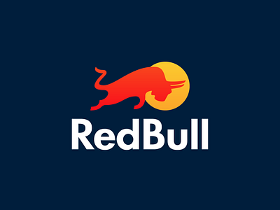


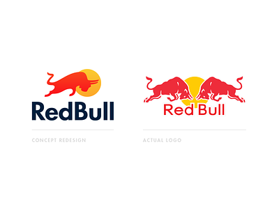
Hi everyone, continuing the redesign series with this concept for RedBull Energy Drink. They have an iconic logo which is recognizable but in my opinion is a bit to cluttered. My version is based on the same idea of a charging bull, but with a cleaner silhouette shape wise and bolder type to complement the mark.
Feedback welcome as always, Thank you!