CDS Construction (BWR)
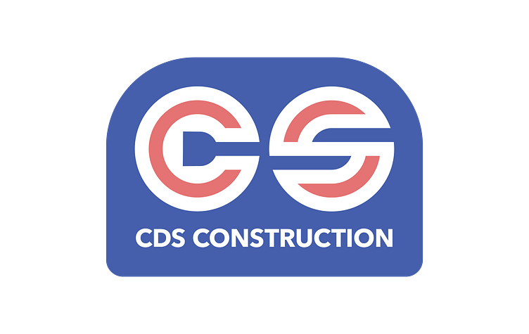
Client is a small construction company in small-town Alaska. I was seeking to evoke the feel of the pre-80s modern logo aesthetic (aka I was taking in a lot of Aaron Draplin talks).
I wanted to include the letter shapes in the mark, but also was seeking after a strong grid. Each letter "circle" is on a 9x9 circular grid, with adjustments for the D. The D and the C's counter hint at a screw head, drill bit, or hex driver.
Ultimately the client went with designs in another aesthetic direction, but these were my favorite.
More by Jayson Whelpley View profile
Like
