Matthew Santos
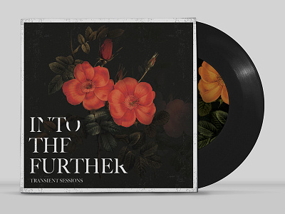
Second concept for Matthew Santos' new album art. It came out a little dark here, but there are some leaves overlapping the text, thats why the type might look a little weird in this shot.
More by John Herskind View profile
Like
